

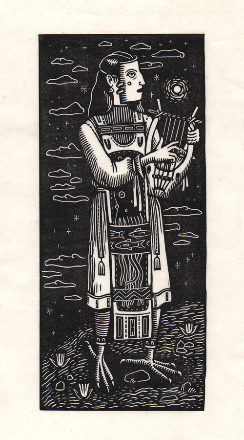
Main Image, ‘Caller’ The sixth print in ongoing series, Other Islands.
“I draw stylistic and conceptual influence from nature, contemporary fiction, Medieval and ancient art, pre-Colonial American art, myths, ukiyo-e, and the decorative arts, particularly those of early twentieth century America,” source
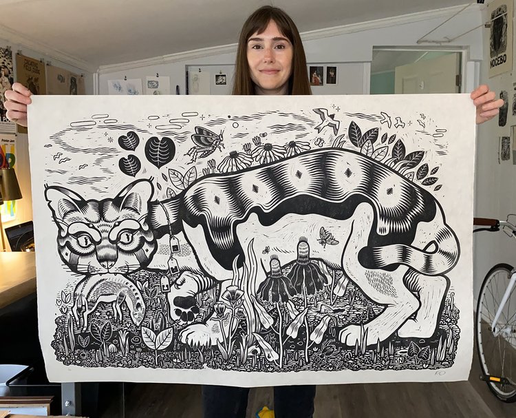
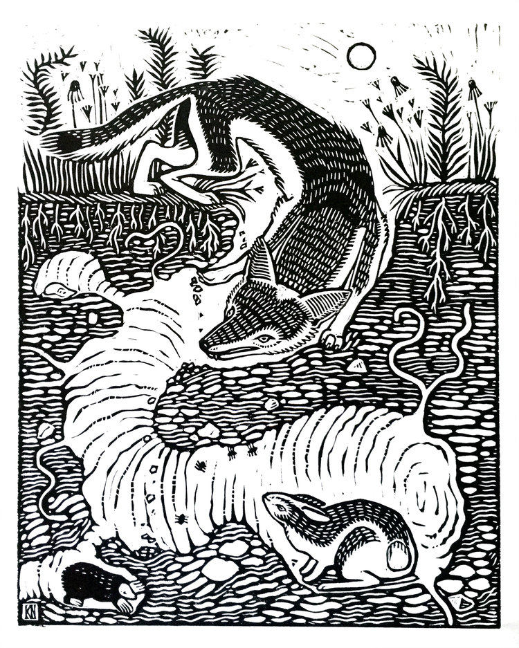
Above, Kathleen Neeley and her linocut print ‘Marauder’
I’m most inspired by nature and books. Much of the content of my prints are personal stories layered under themes of environmentalism…
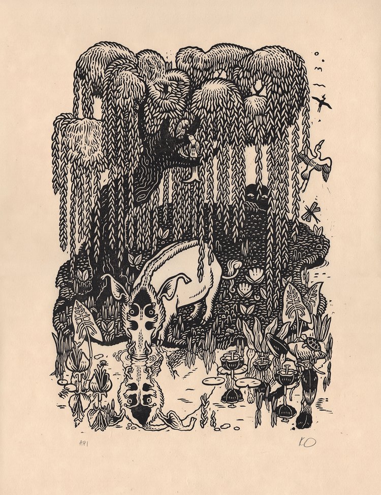
Above, ‘Willow’ (key proof). This is the key image for a multi-block color linocut, in progress. Part of the The Understory.
I do commercial work sometimes, mostly album and poster art. Lately I’ve been making more book illustrations, which I really love and hope to keep doing.
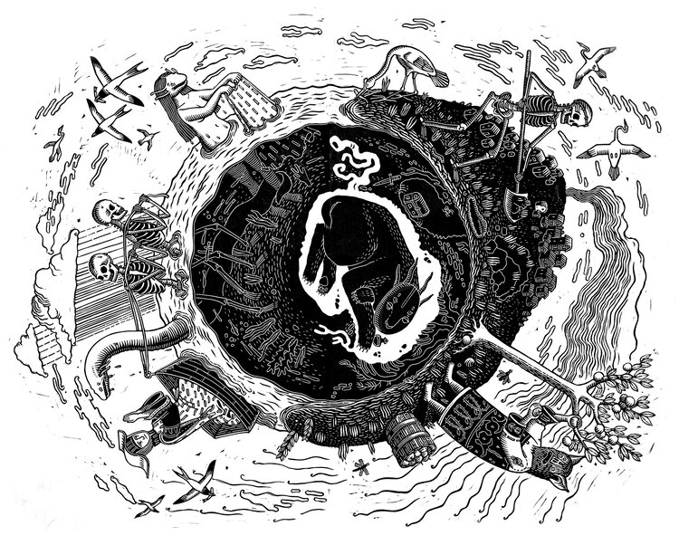
Above, Linocut and Digital. Commission for Sailors Grave Brewing
I’m not sure I have a favorite but I’m quite proud of my most recent color linocut, Moss Lord. It was one of those rare freak things where you see the scene in your head and fall in love with it and somehow it turns out the way you pictured.
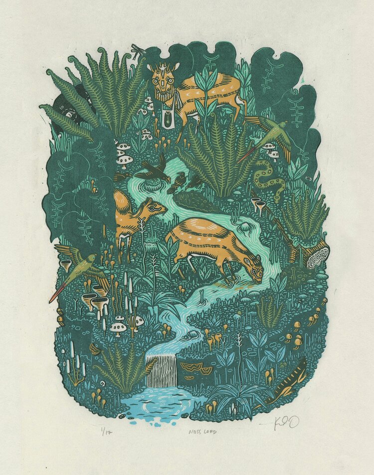
Above ‘Moss Lord’ A Five-color multi-block linocut. Part of The Understory.
Learning how to make multi-block color prints was a big deal for me. Up to that point, the only color relief print technique I knew was reduction, which is arguably more efficient and easier than multi-block, but it has the serious limitation of not being able to reprint. Once you cut the key, that’s it. No possibility of alternate colorways or future editions.
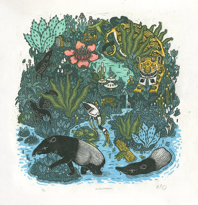
Above, ‘Downstream’ Five-color multi-block linocut. Part of The Understory.
I was first introduced to linocuts by my high school art teacher…
…My (bad) college art was figurative and mostly themed around nature and myths—not too different from what I make now.
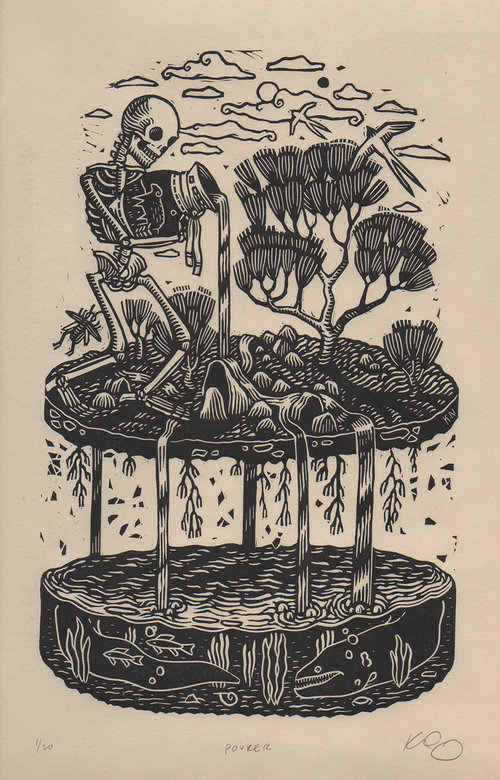
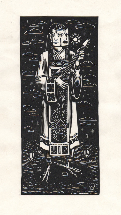
Above, ‘Pourer’ Part of Other Islands.
My studio is a dining room that is never used for actual dining. There’s a secondhand table for carving, a workbench for printing, and a tall metal flat file where I store prints and paper and art I keep meaning to get framed.
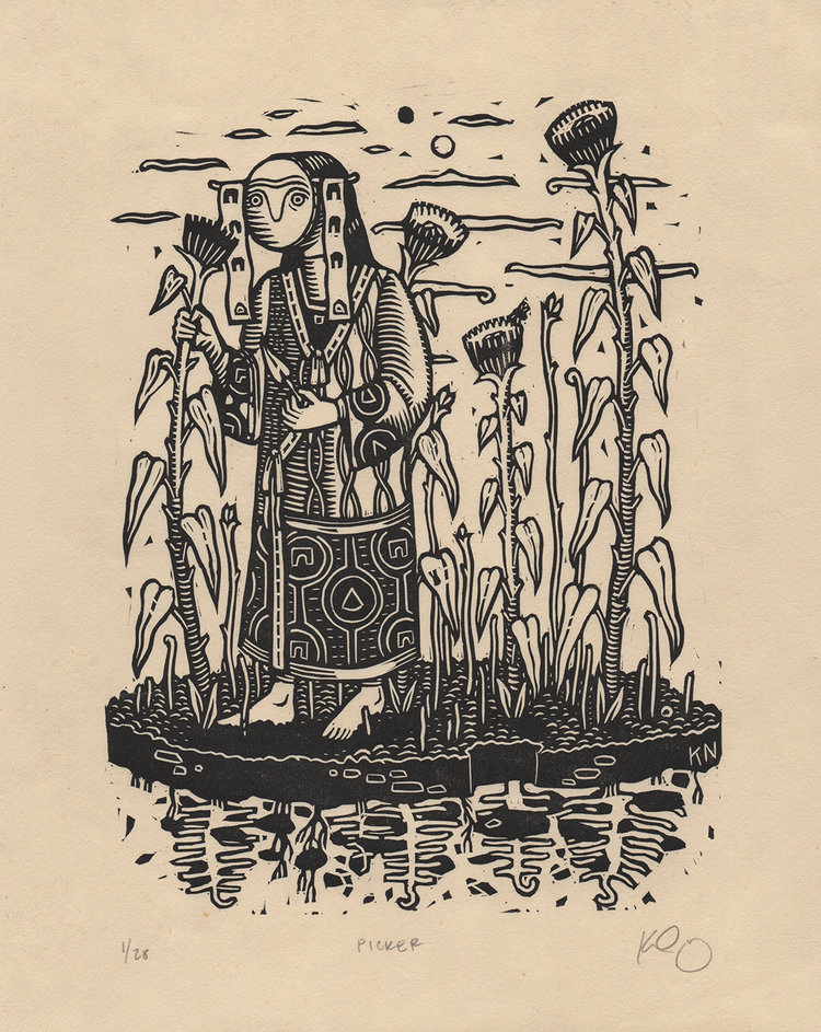
Above, ‘Picker’ Part of Other Islands.
I like seeing what’s behind the figures, seeing more of the world they’re in, and I guess this naturally translates into a sort of 3D look. Plus I just like pushing the two-dimensionality associated with this medium. I like layers interacting with each other.
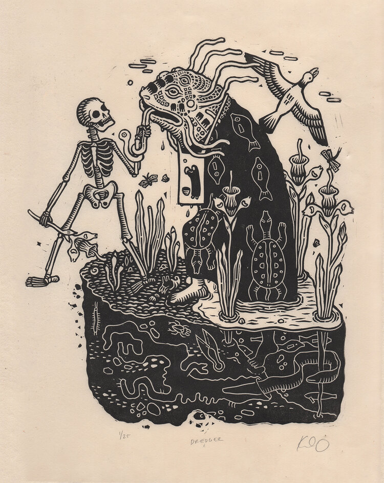
Above, ‘Dredger’ The eighth print in ongoing series, Other Islands.
I just really like carving on linoleum. I find I can get finer details and cleaner lines than I was with wood. Plus you don’t have to worry about grain.
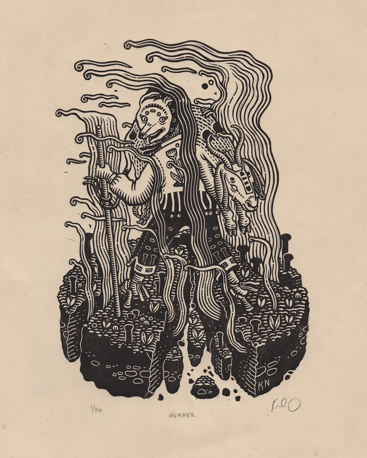
Above, ‘Herder’ The eleventh print in ongoing series, Other Islands.
[She uses] A baren for large areas of black, then a metal spoon…
…Pfeil carving tools, mostly Speedball and Cranfield relief ink, and Awagami paper (specifically kitakata and okawara).
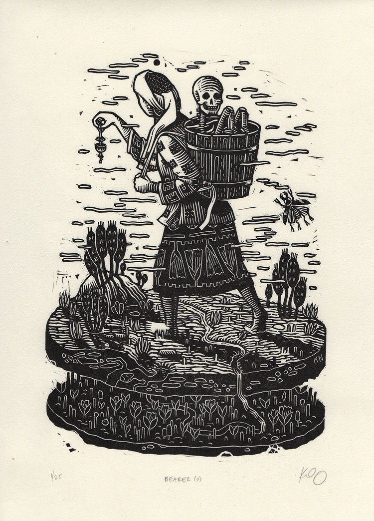
Above, ‘Bearer’ Part of Other Islands.
Printing is the most exciting part of the process, but it’s also the most physically demanding—and, when a print doesn’t turn out how you planned, the most disappointing.
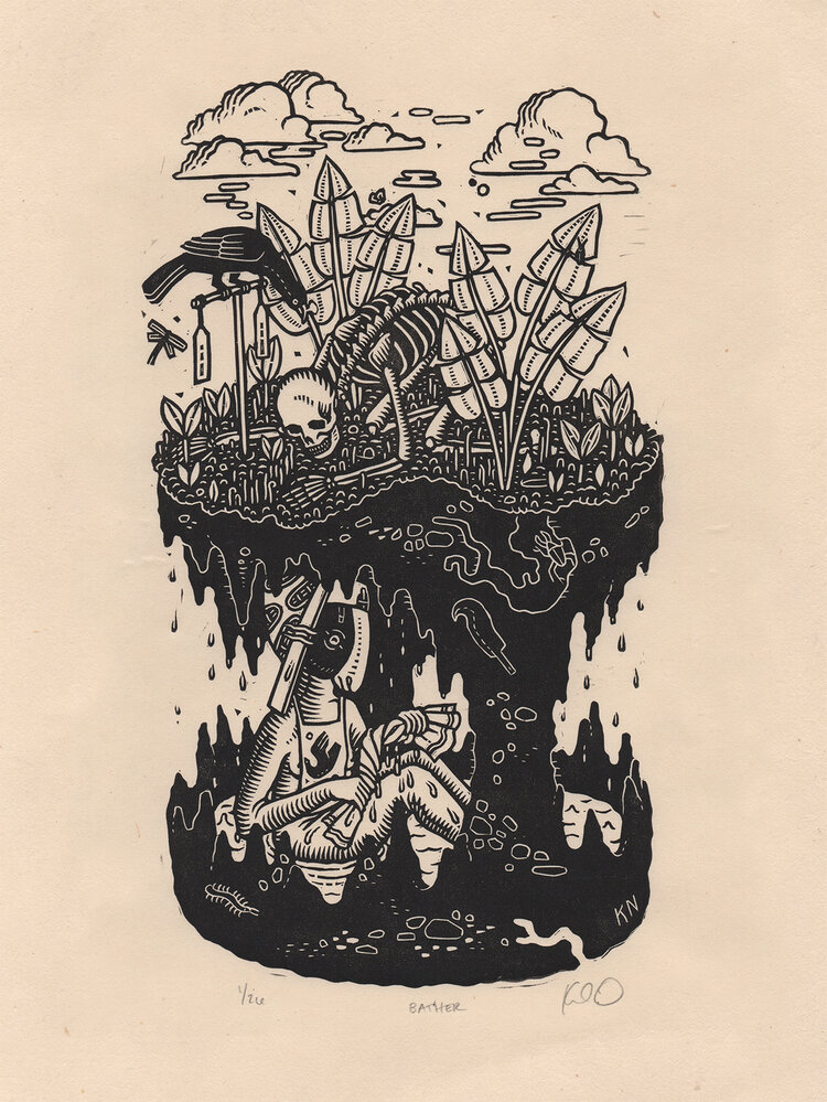
Above, ‘Bather’ Part of Other Islands.
I love to draw, though I think carving is probably my favorite aspect of making prints. It’s extremely satisfying to physically work the image out of the block.
Above 3 images, ‘Botar Sirens’ Commission for Bandits of the Acoustic Revolution.
I think translating complicated visual narratives into tidy black and white lines is always going to be appealing—for more reasons than just cost-effective translation to print mediums, like comics and books. It sometimes feels to me like a wish for our own lives and problems to be as cleanly solvable. Or, if not actually solvable, then at least aesthetically pleasing.
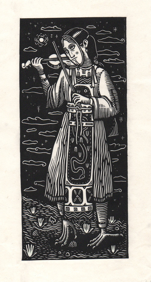
Above, ‘Cornered but not caught’
All quotes from Draw Cut Ink Press, unless otherwise stated
Her website
She’s also active on Bluesky: @kathleenneeley.bsky.social
I had no idea, thanks for the info 👍