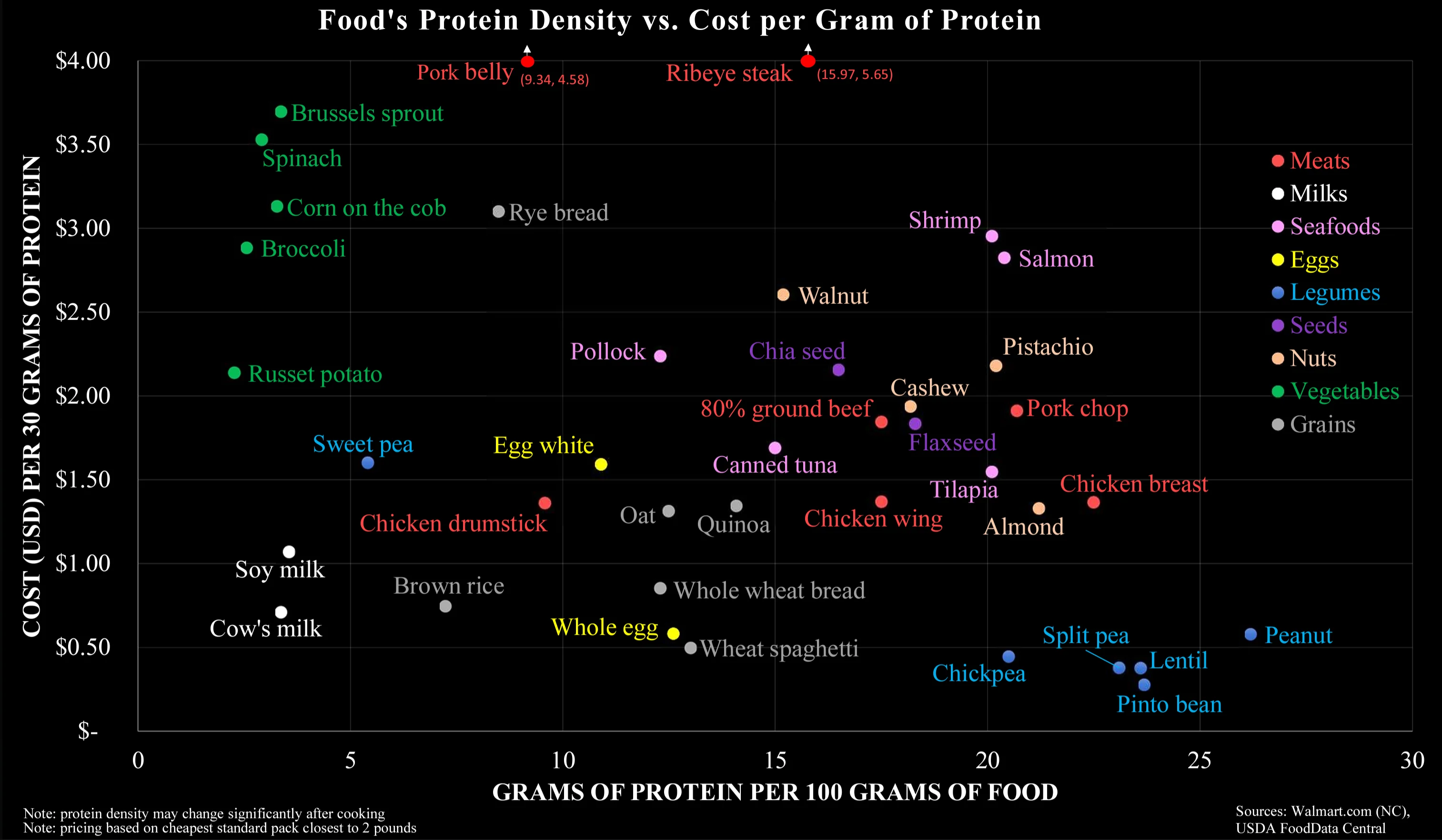
I assume this chart is intended for people making an effort to eat as much protein as possible for as cheap as possible, I.e. bodybuilders, powerlifters, and the like. In that case you would want to avoid vegetables because of their low protein regardless of how much they actually cost, so the cost per gram of protein is actually more useful.
In fairness I may be reading too much into it; nothing about the chart actually specifies who it’s for.
Fair point, I guess this would be a good reason to plot it like this. Maybe the author of the graph should have labeled it accordingly to avoid confusion though…