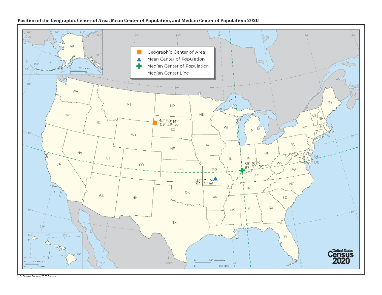
It’s easier for me to visualize it as posted, with an x and y axis. The presentation gets the data across without having to show it as a heat map, clusters, etc. I once tried to explain excitedly to someone that I had just learned that the center of the US as a landmass is in South Dakota. I wish I’d had this map at the time.


It’s easier for me to visualize it as posted, with an x and y axis. The presentation gets the data across without having to show it as a heat map, clusters, etc. I once tried to explain excitedly to someone that I had just learned that the center of the US as a landmass is in South Dakota. I wish I’d had this map at the time.