For McLaren it says n=63, but pictured on the graphic is 85 pitstops, of which 22 are painted orange. 22/63 is the figure used for the percentage though.
I think it would help to use to same grid for the squares for all teams. You’d need a grid of 5 by 14, leave the not performed squares black. In that way a higher colored stack means more quick pitstops, a higher stack of grey squares means a higher amount of performed stops overall.


![[@code____F1] Pitstops less than 2.5 seconds for the top 4 constructors](https://lemmy.world/pictrs/image/fc9a96b9-cdb8-4aa4-9804-8a92983c257f.jpeg)
For McLaren it says
n=63, but pictured on the graphic is 85 pitstops, of which 22 are painted orange. 22/63 is the figure used for the percentage though.It’s mildly annoying that they didn’t use the same number of pitstops for all four
I assume they have done different amounts though, so how would you split it? I assume that the conditions at different races would effect the times.
Couldn’t help myself and quickly created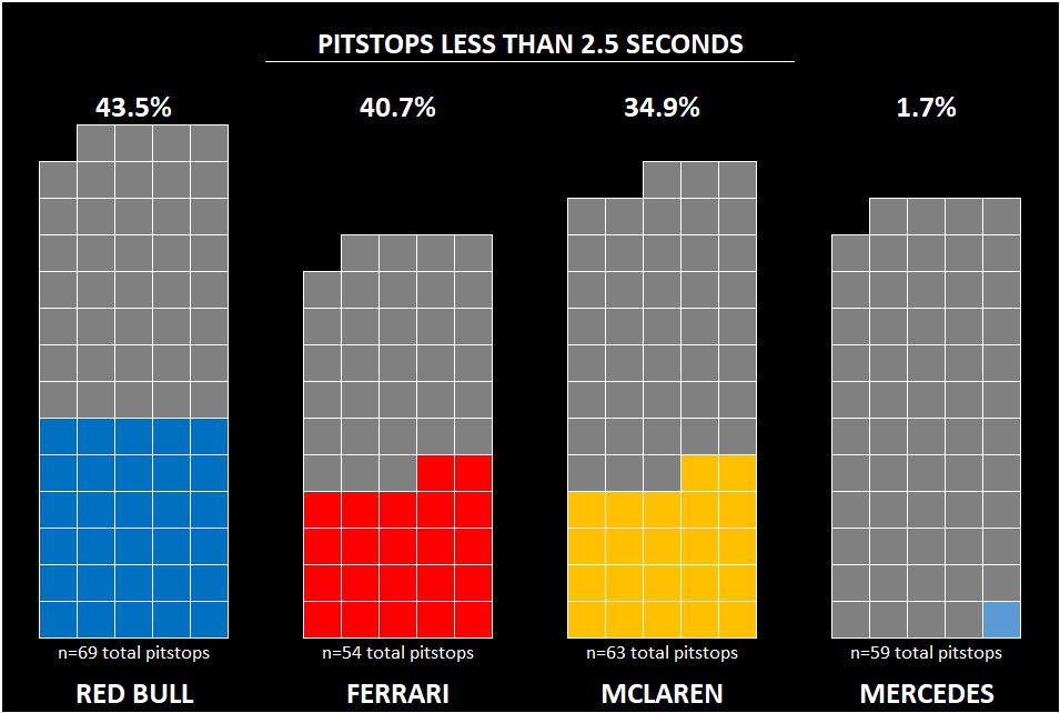 in excel. It’s not as fancy, but feel like it gives a better idea
Looks so much better!
I think it would help to use to same grid for the squares for all teams. You’d need a grid of 5 by 14, leave the not performed squares black. In that way a higher colored stack means more quick pitstops, a higher stack of grey squares means a higher amount of performed stops overall.
I’d just take the last 50