
It’s Friday! There was no prompt last week because I sort of went into lurk mode - it’s a bad habit that I need to work on.
This week’s prompt is black and white.
Whether it’s a two-tone cat or something quite mundane made dramatic with filters, I want to see how the lack of colour can be a focus of your shot.
Usual rules apply: No NSFW and no shots you didn’t take yourself.
I found this really hard. I took a bunch of pictures that I thought had high contrast; trees, flowers, bushes, bark patterns. But when I converted them to black and white none of them really popped.
Here’s my favourite from what I got, but still not that happy with it.
I like it, it feels kind of tense, like something is about to emerge into view.
Thanks!
Which method of converting to black and white did you use? It feels to me like that one is more grayscale. You might also just tweak the black point and sharpness to see if that helps? Here is one I took of Wrights Hill fortress awhile back, I basically did that to it.
I had the image open in Digikam and used the editor to convert it. There were a few options but I just tried them out.
I gotta admit, I don’t know the difference. Is this one greyscale and the others posted black and white?
I expect you can guess the difference between grayscale and black and white based on the names - essentially black and white contains only those two, while grayscale has assorted gray shades as well. Black and white can look casually grayscale at high definition where the blacks and whites are mixed (a 100x100 square with 50% black and 50% white equally distributed throughout is going to look gray on first glance at a distance).
I can’t say if your image is grayscale because I have not properly looked at it - it just feels that way on first glance. I’m also not familiar with digikam so I don’t know what it defaults to when converting color to monochrome.
I do like the composition, btw.
Any digital image is actually red green and blue, those are the colors of the pixels on your monitor. When there’s enough of them your brain is tricked into seeing other colors. To get even more meta, all colors are just made up by your brain.
So I don’t understand your distinction between black and white, and grayscale. Whether it’s a gray made of black and white pixels or a “pure gray” doesn’t matter, it can look the same. Unless it’s a style where the pixels are supposed to be visible, e.g. pointillism.
Modern monitors do black (pixel off), and white (all three colours at once), as well as grayscale (method varies depending on display type). All of this means that images are displayed in the colors they contain. Or in this case, don’t contain.
Grayscale will display differently to black and white or sepia or full colour.
Okay, here’s one I found on my phone and desaturated just now.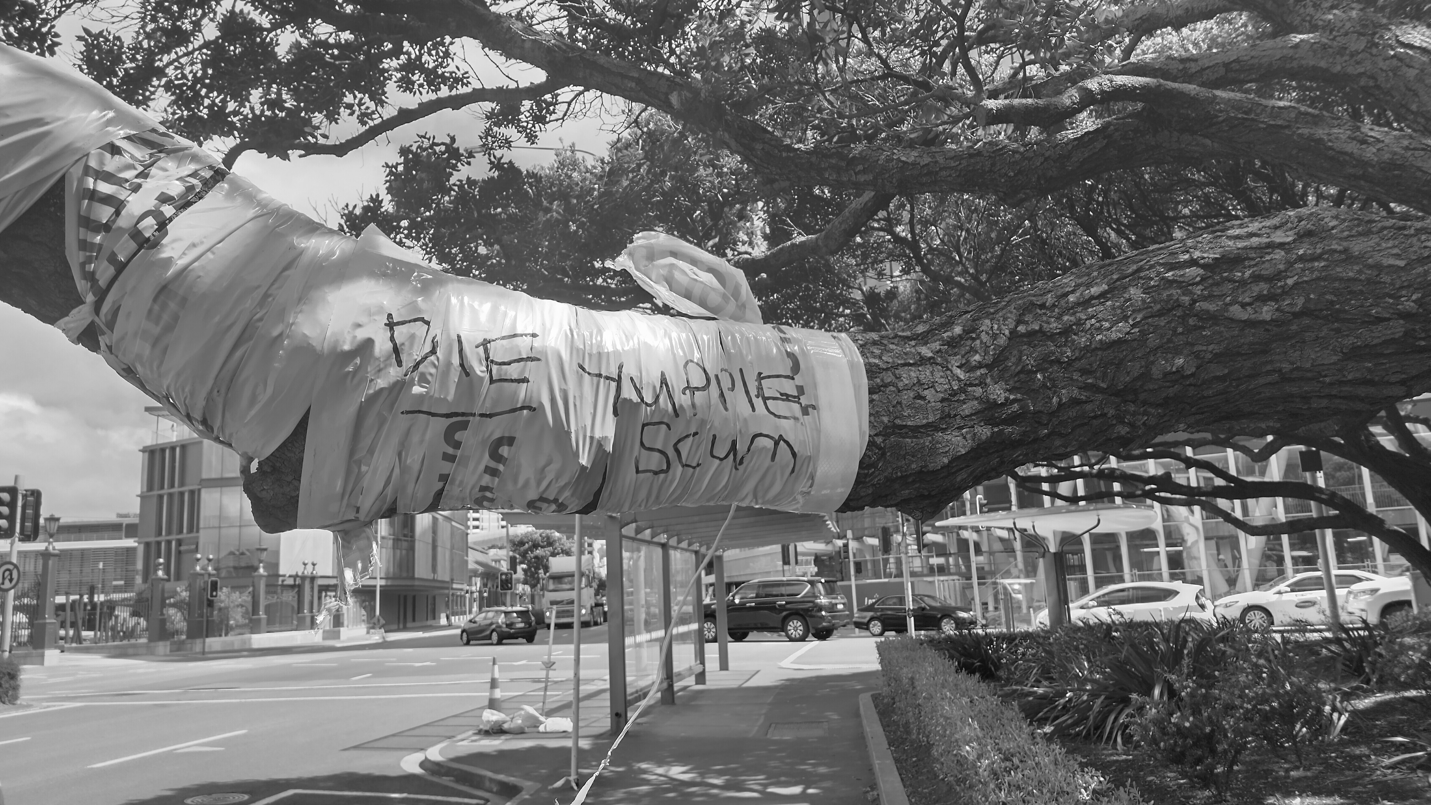
Then here’s the version where I upped the contrast, decreased black point and shadows, and increased white point.
Colour version for reference
Thanks! I also am not very familiar with Digikam, in terms of image editing. I opened it in GIMP and tried adjusting the things you suggested. Here’s a new version, it definitely looks more black/white but not sure if it’s an improvement:
It’s kind of up to you if you’re happy with it, but it does seem more stark now.
Yes, I guess each have their own good qualities.