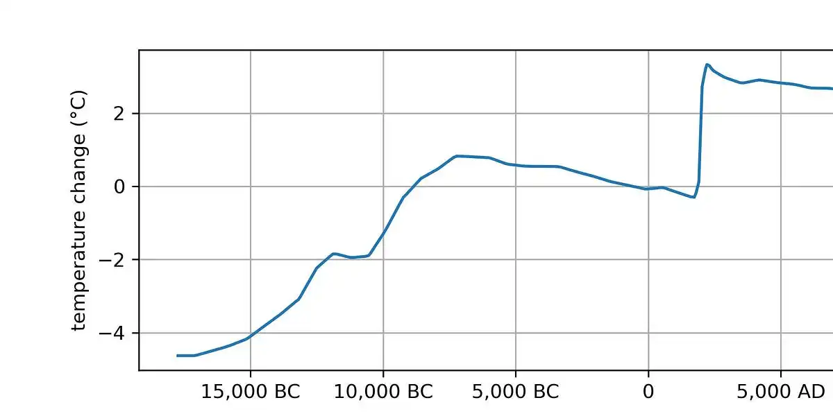
I get what’s going on here (and am scared for the future), but is this a good plot? I have no idea if 5,000 years is a meaningful term for climatology – for all I know it could have been picked just to make the 1900-2000 man-made spike look nice and vertical. You could plot no a 10,000 year scale that would make the jump from 10k BC - 5k BC look nearly as straight, and of course use a smaller scale to make shorter-term climate blips (or even weather patterns) look just as scary.
It’s a pretty good plot if you want to understand the time period where civilization has existed; it shows the warming which was going on for the few thousand years before civilization, the relatively stable temperatures during civilization, and then the sudden modern warming from fossil fuel burning, and what we expect to happen after we’re done burning fossil fuels.
Yeah it’s great because it’s a very small slice of earths history. It shows how dramatic the affect we humans have had on earths climate has been.
Earths climate has done crazy things.
See history of the world on YouTube. The stuff earth has been through is crazy.
But the key is how long it takes for something so dramatic to happen to earth. The great dying, snowball earth, etc etc all takes hundreds of thousands of years. Not hundreds of years.
And we can see in the geologic record how fucking extreme the consequences were for life on earth in those events. Extrapolating to what we are doing here, it could be an extinction event. We won’t know it because it’ll still be thousands of years for that irreversible process to happen.
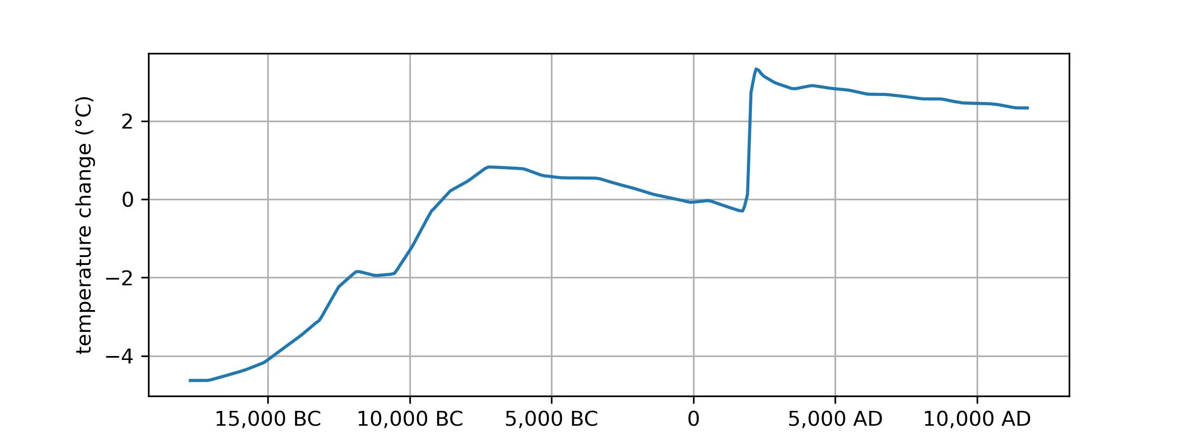
https://youtu.be/uxTO2w0fbB4?si=G2SL3Gh-GqQlDR6h
https://youtu.be/H476c8UjLXY?si=fY6moTrWa2_iZtRn
https://youtu.be/rwHFwltF4yk?si=-wVgVQxJEOc7m-Ba
Look at this xkcd that’s much less arbitrary about it’s time scale
https://xkcd.com/1732/
In short, the time scale they are showing this graph on is generous if anything.