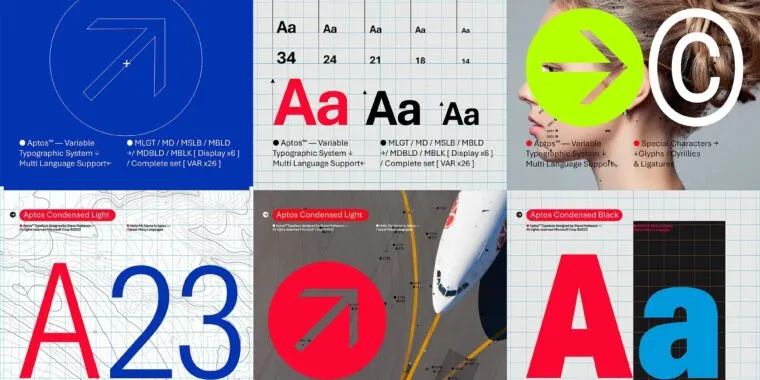
I like the friendlier feeling of Seaford (the o shapes have a little tilt to them rather than being straight on the grid), but I’m guessing they leaned towards the most “generic” of the five because as a default font you want it to become “invisible” almost. I think a more unique font would stand out and then become a little grating over time given how much it would be seen.

Agreed on the name.
As for the others, I’m a fan of Tenorite. Squattier than the rest, but it has the most “character”
I like the friendlier feeling of Seaford (the o shapes have a little tilt to them rather than being straight on the grid), but I’m guessing they leaned towards the most “generic” of the five because as a default font you want it to become “invisible” almost. I think a more unique font would stand out and then become a little grating over time given how much it would be seen.
@surrendertogravity Seaford was my favorite of the group, too. It feels like it has a bit more weight, like it’s more “official” or something.
Hopefully they’ll include it as a choice as well, even if it’s not the “default”.