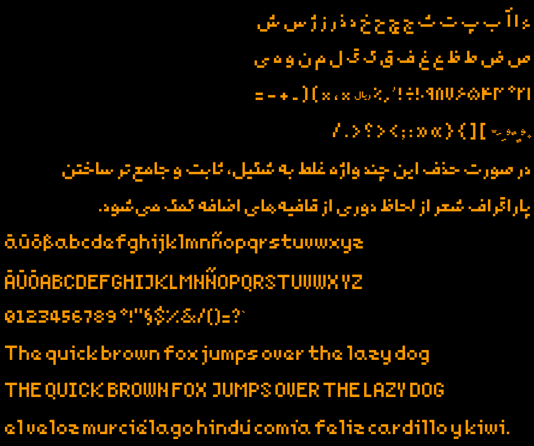
Last year I made a new pixelated free typeface for my 2d game. It has Arabic, Persian, and a subset of Latin glyphs enough for English, German and Spanish texts. Inside the repo you’d find makefile to build the font and generate test outputs.
Since it was my first experience designing a typeface ever, I might have made mistakes not known to me. That’s why I post this, hoping someone would point them out. Here is the repo
The spacing is something I noticed, too, and I agree with the umlaut thing. The small “e” looks a little awkward - like it doesn’t quite know if it’s an “a” or “e”. You could try making some tweaks to it. You could also see if adding an extra space inside big V and Y would make them more aligned with the rest of the letters.
I’m sorry, this probably sounds like some font snob nitpicking. On a more positive note, I absolutely adore the small “z”! Real solid work for a first experiment.
Yes, small e was one of the most difficult and as you mentioned needs work. Currently, it’s a compromise to fit it inside a 4x4 space. I’ll reiterate on it and probably post variations later.
I’ll experiment with adding space inside U and V. I wanted to reuse V inside W, that’s why it’s so narrow.
Thanks for the feedback.
PS: and I’m really glad that you liked the lower case z! It was a breakthrough for myself when I came up with the shape on my screen. Didn’t work for the capital letter though. (I also tried to avoid making it look similar to WWII SS signs)