A good map is simple. This shows one measure very clearly. Adding another dimension would likely make the core purpose harder to interpret.
There is an age old adage “All maps lie” - which is basically another way of saying simplification is key to useful presentation. …aerial photos aren’t very useful for navigation!

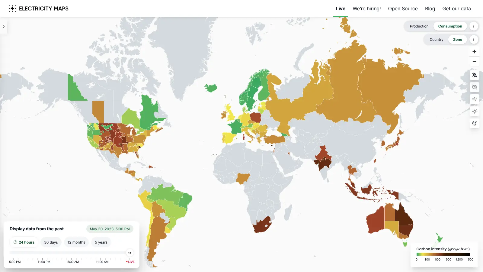
You can still normalize based on your totals. Otherwise the coloring is not that useful.
Eg. Western Area Power covers a large part of the US but only produces 5GW.
PJM produces 100GW and covers around the same area including 20GW of coal, 7x that of Western Area.
There should be an option to normalize so you can quickly see where most of the emissions come from.
A good map is simple. This shows one measure very clearly. Adding another dimension would likely make the core purpose harder to interpret.
There is an age old adage “All maps lie” - which is basically another way of saying simplification is key to useful presentation. …aerial photos aren’t very useful for navigation!