
Let me know if this isnt appropriate for this community. Still new here, but I live in a place with a highly variable electricity grid.
Sometimes we’re running mostly on coal, othertimes a good amount of wind generation kicks in and our grid runs cleaner. I’ve been using this site as a means of tracking when our grid is running on more renewable resources in order to make decisions about energy use (mostly when to plug my car in).
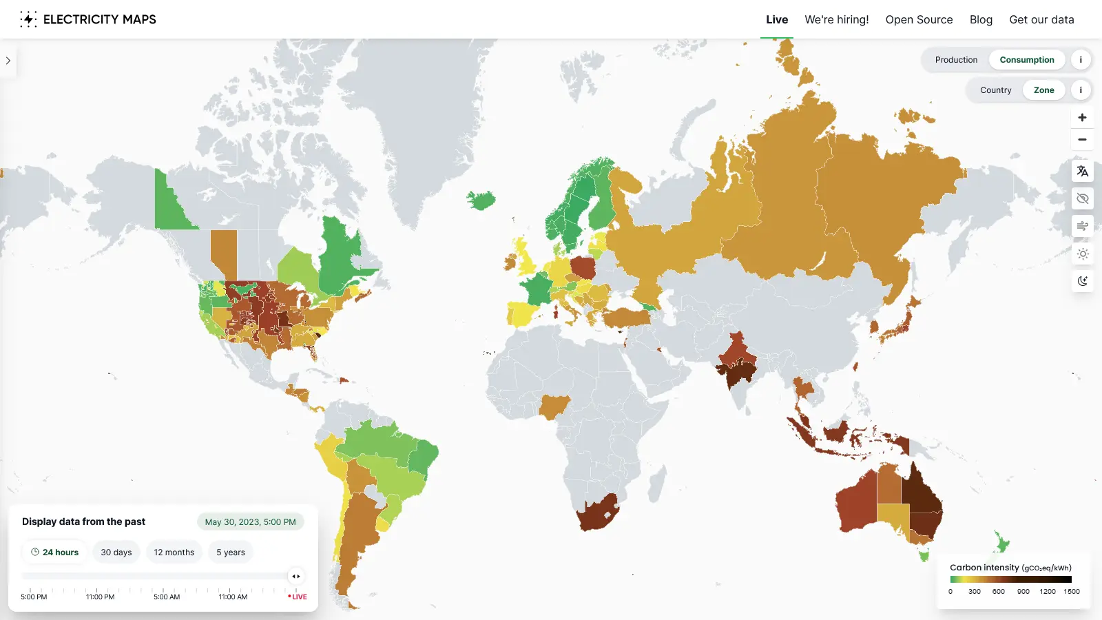
Keep in mind, there is a certain amount of estimation and assumptions going on here but the site shows stats like current generation, use, percent renewable, co2 emission estimates, etc.
Thought it might be useful to folks. Theres an app too for those interested.
Thank you very much. This is really helpful.
This website makes very different assumptions about carbon intensity between different countries (and extremely dated ones) and doesn’t justify the selection at all. Use it with care and ignore their gCO2/kWh as anything other than a vague guideline.
Makes sense. I think its cobbled together with what info and data the designer has access to.
The utility in my region used to report percent generation information themselves on their website but stopped. This website taps into that same data so I use it as a general indicator of when renewable generation is high.
I think its cobbled together with what info and data the designer has access to.
This doesn’t really explain picking different sources for gCO2e/kWh for different countries using the same technology (especially when it is provably inaccurate in some instances, live more accurate data is available and it has been pointed out to the author). There is a bit of politics going on, which is a shame because it’s otherwise excellent work.
Useful overview, but grain of salt for any specific conclusions (especially between countries or in times/places where it is “estimating”).
Many regions have a country-specific site which often has a bit more detail and is more accurate
Fair enough.
To be honest, I wouldnt advise anyone to take CO2 per kWh estimates as more than just that, an estimate. Some are more accurate than others, sure, but at the end of the day you have to be comfortable with there being wiggle room.
For clarity, Im coming at this from a Canadian perspective. Our utilities here tend to be abyssmal when it comes to transparency. Good to see other regions have better reporting options.
energy-charts is great for Germany, but has some issues with other countries. The Netherlands are a great example. There was a recent residential solar boom, which means power plants are shut down. energy-charts displays this as a lower load and is not able to show the added solar. Obviously this is wrong. However the prices are intressting and accurate.
It’s not great for germany. All coal is assumed to be as dirty as the dirtiest lignite, utility solar is assumed to have the same lifetime and embodied carbon as it did in the 2000s, german gas is mysteriously assumed to be 20% worse than gas elsewhere no matter which plants are actually running (although still only half of the real emissions including fugitive methane) and it is not good at accounting for residential or commercial solar there either.
Im jealous of all the progress countries are making. In my province theyre outlawing the use of coal by 2030. So the plan? Theyre going to convert all the coal plants…to oil.
Great.
Sorry, but where in the world is Exxon in full control of the government?
Its Canada. Our utility is literally a monopoly in my province which means they can get away with almost anything. It sucks. The good news is rooftop solar is picking up quickly.
Great website, thanks for sharing!
Take a look at South Australia, the graphs are funny, that’s what happens when you have more Solar then you know what to do with
Depending on where you are following the sources from this website and doing a bit of digging can get you more accurate data especially for things like local carbon gen.
Ive heard the battery storage there is one of the largest in the world too?