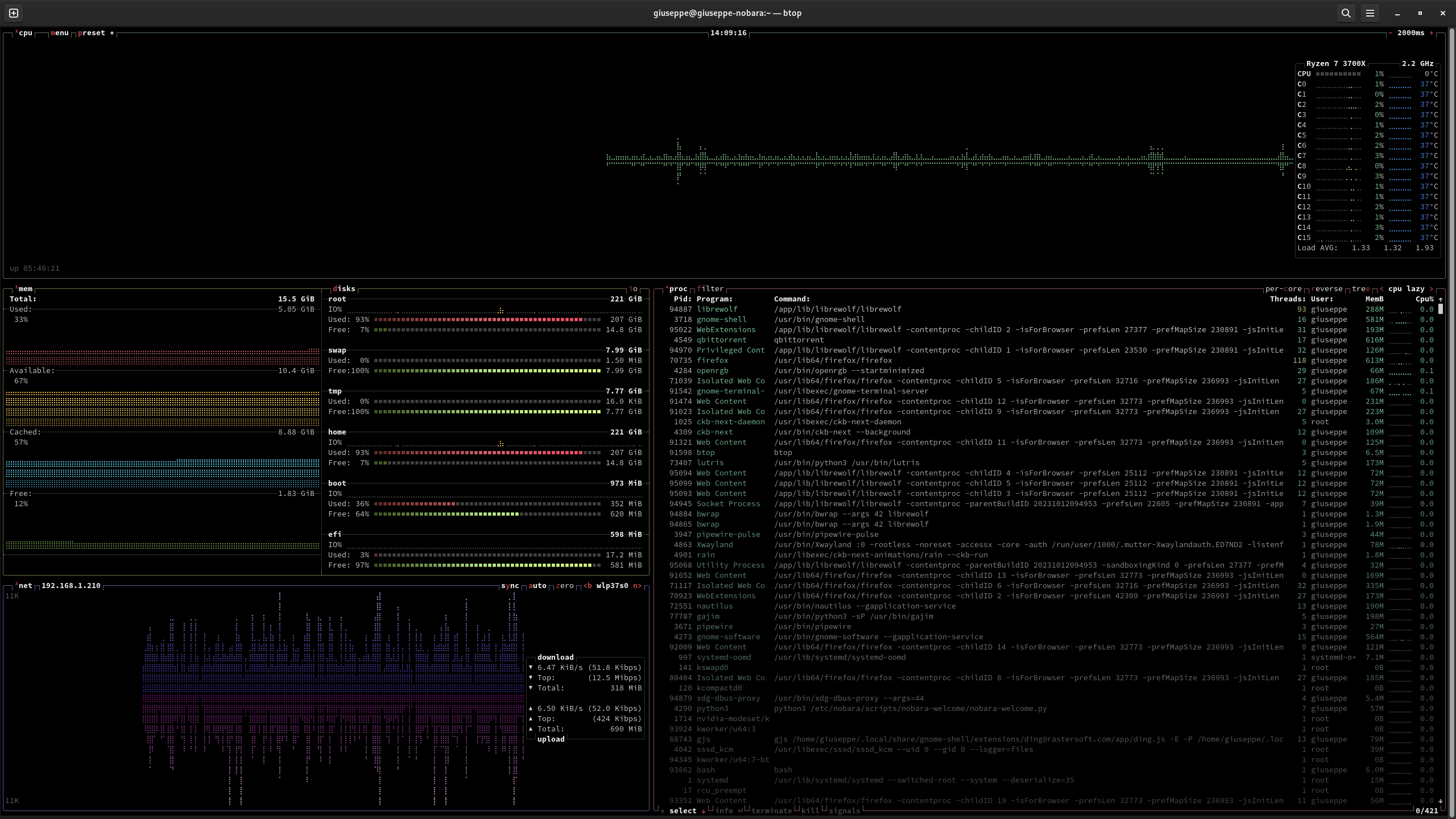
Pro tip: configure a font that doesn’t show open circles for unused braille characters to have a higher priority than your current font to get better-looking graphs.
On my system, braille characters are provided by DejaVu Serif, and it was as easy as just installing the font.
I think they mean the variable width of the graph’s columns. If you watch it as the graph moves, there are gaps at every 2 columns.
I don’t understand though the thing about font priorities.
And also, would that just change all fonts? Unless you mod the font to only have the braille characters…
No, you’ve got it set up right. Many people will have graphs where each character rectangle has open circles for the unused braile dots in the character block.

Pro tip: configure a font that doesn’t show open circles for unused braille characters to have a higher priority than your current font to get better-looking graphs.
On my system, braille characters are provided by DejaVu Serif, and it was as easy as just installing the font.
Where do you see open circles? I don’t understand sorry
I think they mean the variable width of the graph’s columns. If you watch it as the graph moves, there are gaps at every 2 columns.
I don’t understand though the thing about font priorities.
And also, would that just change all fonts? Unless you mod the font to only have the braille characters…
No, you’ve got it set up right. Many people will have graphs where each character rectangle has open circles for the unused braile dots in the character block.
Here’s an example.
Stop has a block mode, I just use that. Stop is so fancy I love it