
This is great! Although why not flip the letter so that it actually becomes an S?
I did a really quick a dirty edit to see how that’d look.

Definitely like it mirrored better.

I tried rotating it to more clearly resemble an S, but I think it detracts from it, since then it just becomes a letter, instead of a slightly more abstract (and IMO memorable) logo.
I personally prefer the S, but all of these are great really. Considering it’s so close to being an S I feel like a lot of people are going to notice that too, but I might be wrong. It was also discussed a little previously: https://slrpnk.net/post/9709041
I actually like that simpler version much more as an S, something about the increased whitespace around the dot in that version compared to the sun in this version looks a bit better to me. The framing around it helps a bit too, though as you say, all of them a pretty cool.
Actually, the more I look at it the more I agree with you. Thanks for trying out the different variants. I really dig this logo 💚💛
Would also be interesting too see a version of this the other way around. E.g. The plant bit switching position with the gear bit. But thinking about it - it might not make as much sense as plants usually grow upwards(?)
Flippy test!

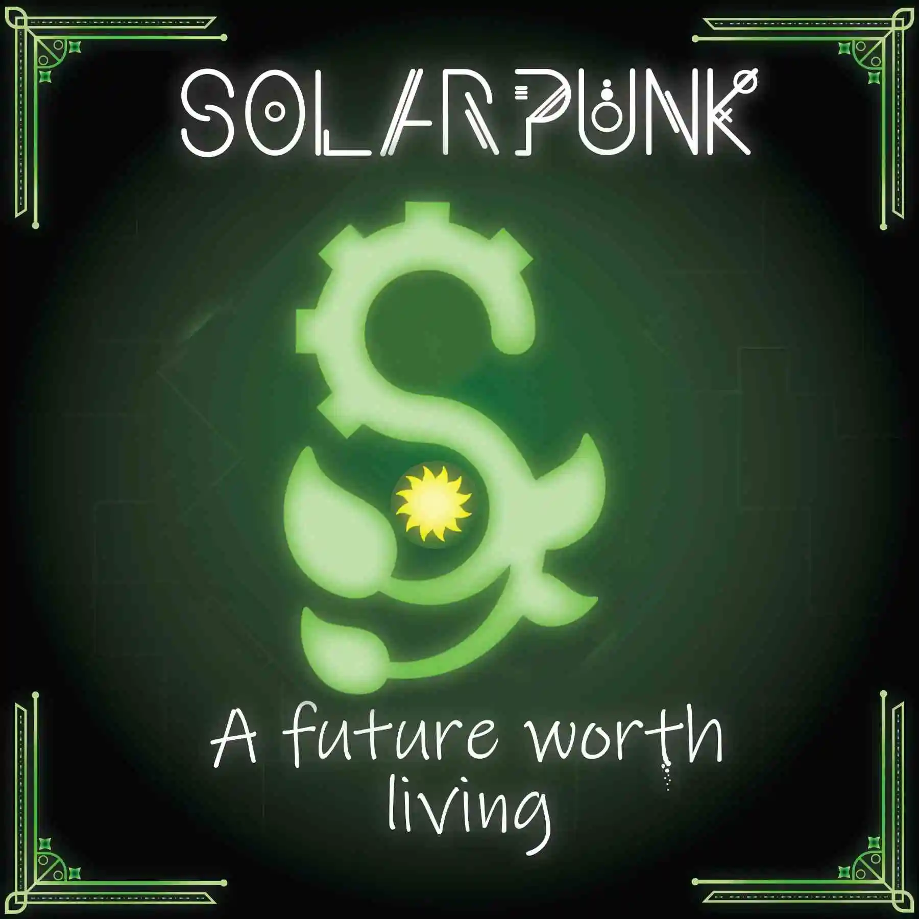
Hmm, I think that design might need something more bespoke.
it might not make as much sense as plants usually grow upwards
There are those upside down tomato planters.
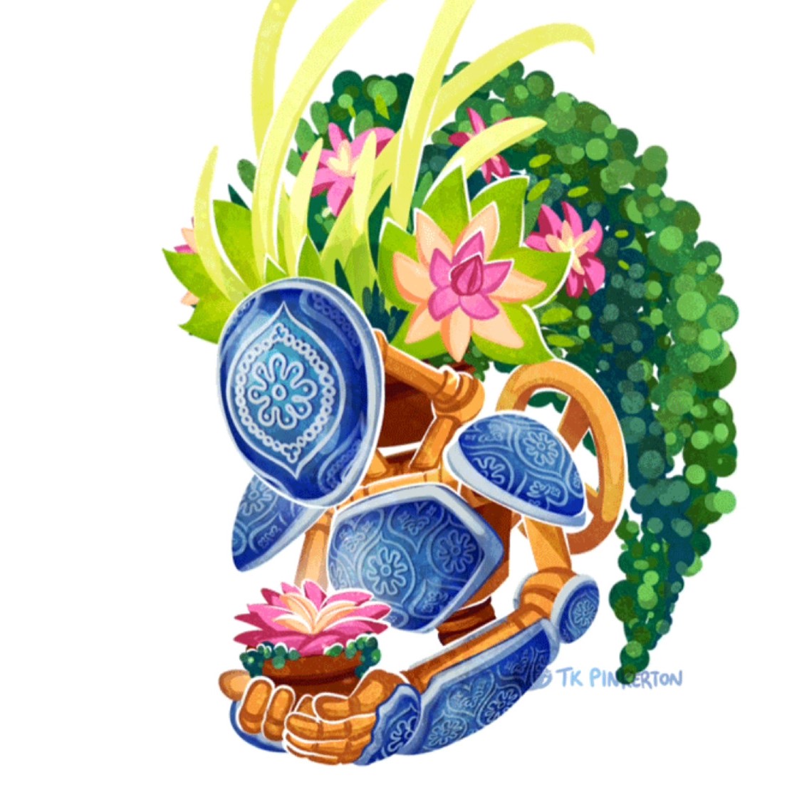
I’m not even a part of this community or instance but I love the art :)
I’m curious about the capital letter font at the top. Is that original?
Saving this!
Love it all put together like this :)
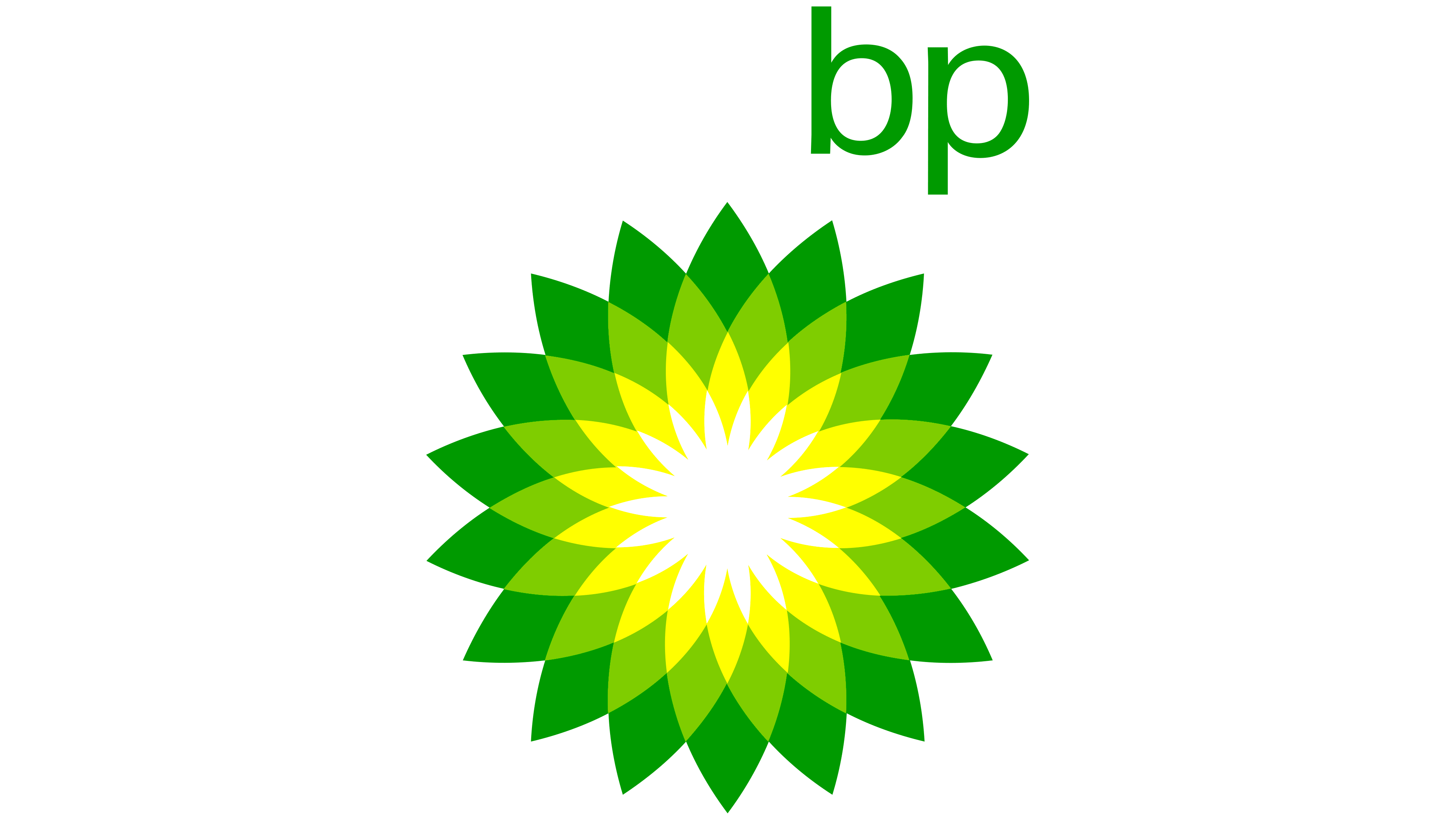
Super close to the BP logo, probably not something you’ll want to associate with.
I’m not really seeing the resemblance other than similar colors, but green and yellow are somewhat solidified as pretty solarpunk-y colors, at least going by the various flags and emblems floating around.


